Ember & Grain is a fictional coffee brand created to explore the intersection of ritual, warmth, and self-expression. The goal wasn’t just to design packaging—it was to build a brand that feels like a daily invitation: slow down, show up, and expresso yourself.

Coffee is a saturated market, dominated by either hyper-minimal third-wave brands or overly rustic, nostalgic aesthetics. The challenge was to create something that felt modern and bold yet grounded in warmth and familiarity.
At the center of the brand is a simple but memorable concept:
coffee as self-expression.
This idea came to life through the phrase “Expresso Yourself”—a playful, slightly unexpected line that gives the brand personality while reinforcing its core message.
From there, everything was built to balance contrast:
-
Bold vs. Warm
-
Structured vs. Organic
- Playful vs. refined
Visual Identity
The identity system is anchored by a confident typographic approach and a flexible badge mark. A circular emblem acts as a grounding device across applications, reinforcing recognition whether on packaging, cups, or future retail touchpoints.
The color palette leans into high-impact warmth:
-
A saturated orange to energize and command attention
-
Deep green to ground the brand in richness and craft
-
Neutral kraft tones to maintain authenticity and tactility
Subtle patterning adds texture without overwhelming the system, allowing the brand to scale across different formats while maintaining cohesion.
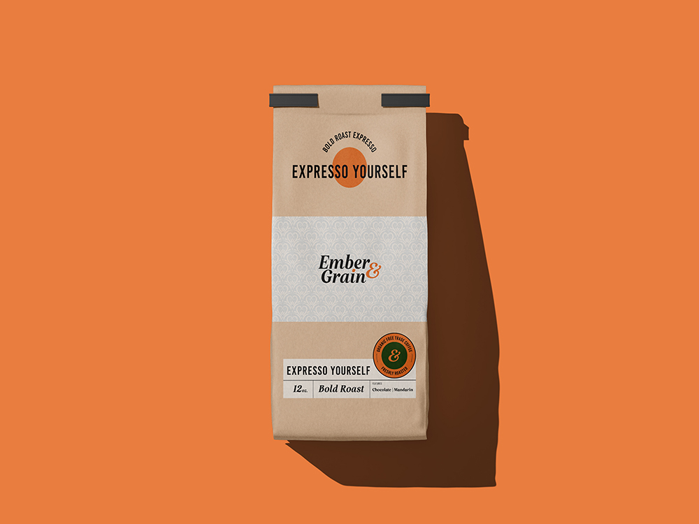
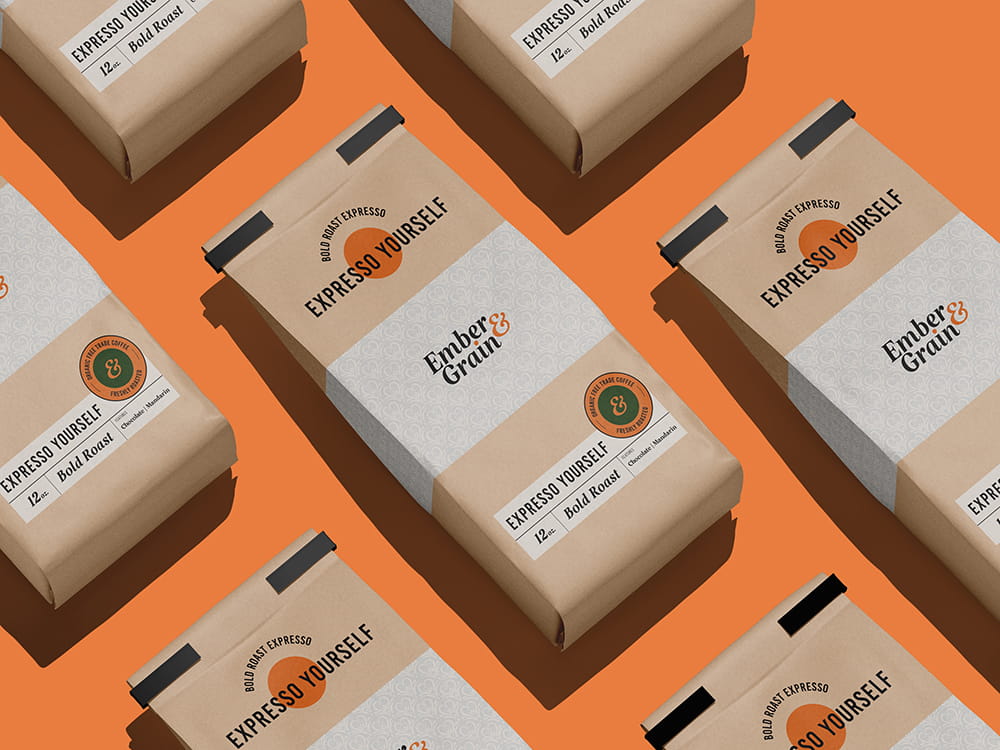
Packaging
The packaging was designed with both shelf presence and production realism in mind.
Kraft coffee bags create an immediate sense of authenticity, while the structured label system allows for easy variation across roasts and blends. The hierarchy is clear and intentional—brand first, personality second, product details third—ensuring quick readability in a retail environment.
Tape details, label placement, and contrast were all considered to create a slightly imperfect, human feel—something that feels crafted rather than overly polished.
Brand in Motion
Extending the identity to coffee cups allowed the system to flex into a more lifestyle-driven application.
The cups introduce a deeper green variation, reinforcing the brand’s richness while maintaining consistency through typography and the circular mark. Floating product visuals emphasize lightness and energy, aligning with the brand’s tone: elevated, but never pretentious.
The Outcome
Ember & Grain demonstrates how a strong concept can carry a brand across multiple touchpoints without losing clarity or character.
It’s a system built for scale—equally at home in a boutique café, on retail shelves, or across digital campaigns—while maintaining a distinct voice that feels both modern and human.