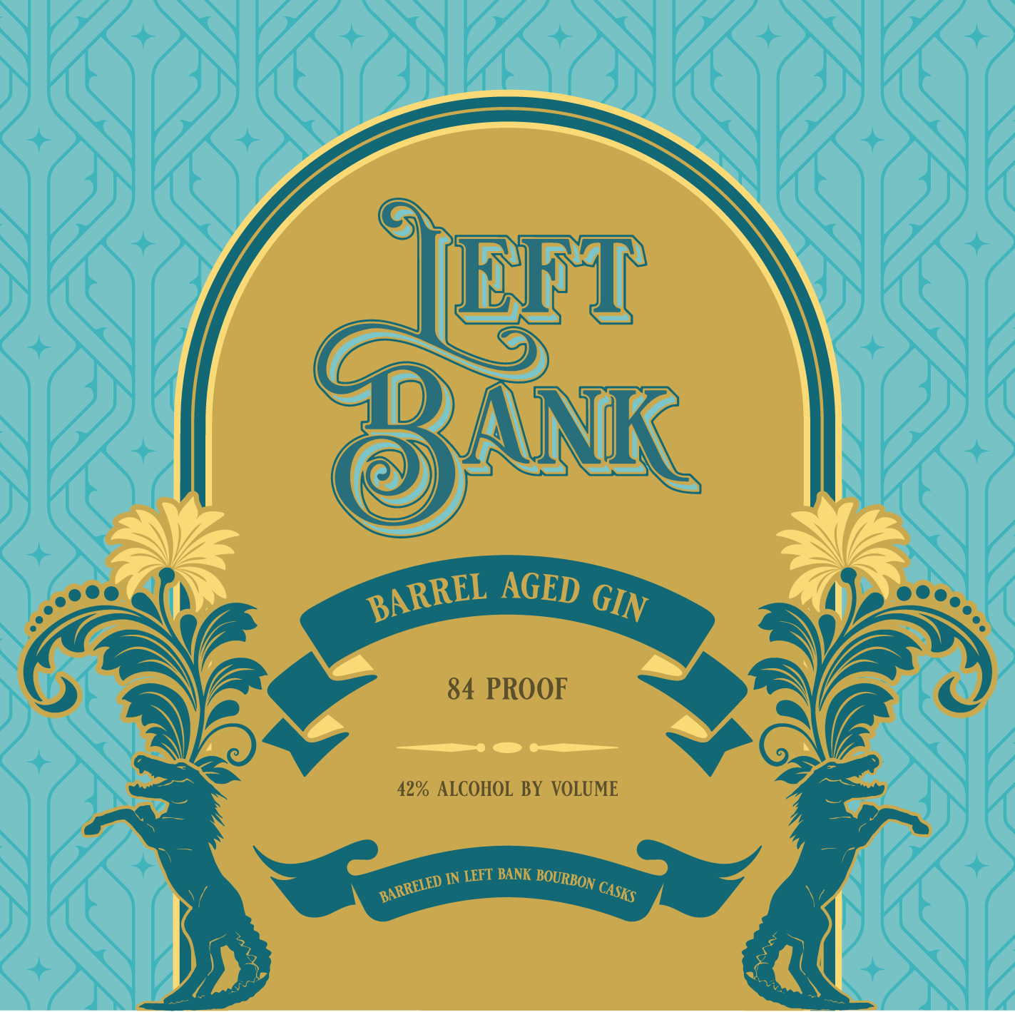
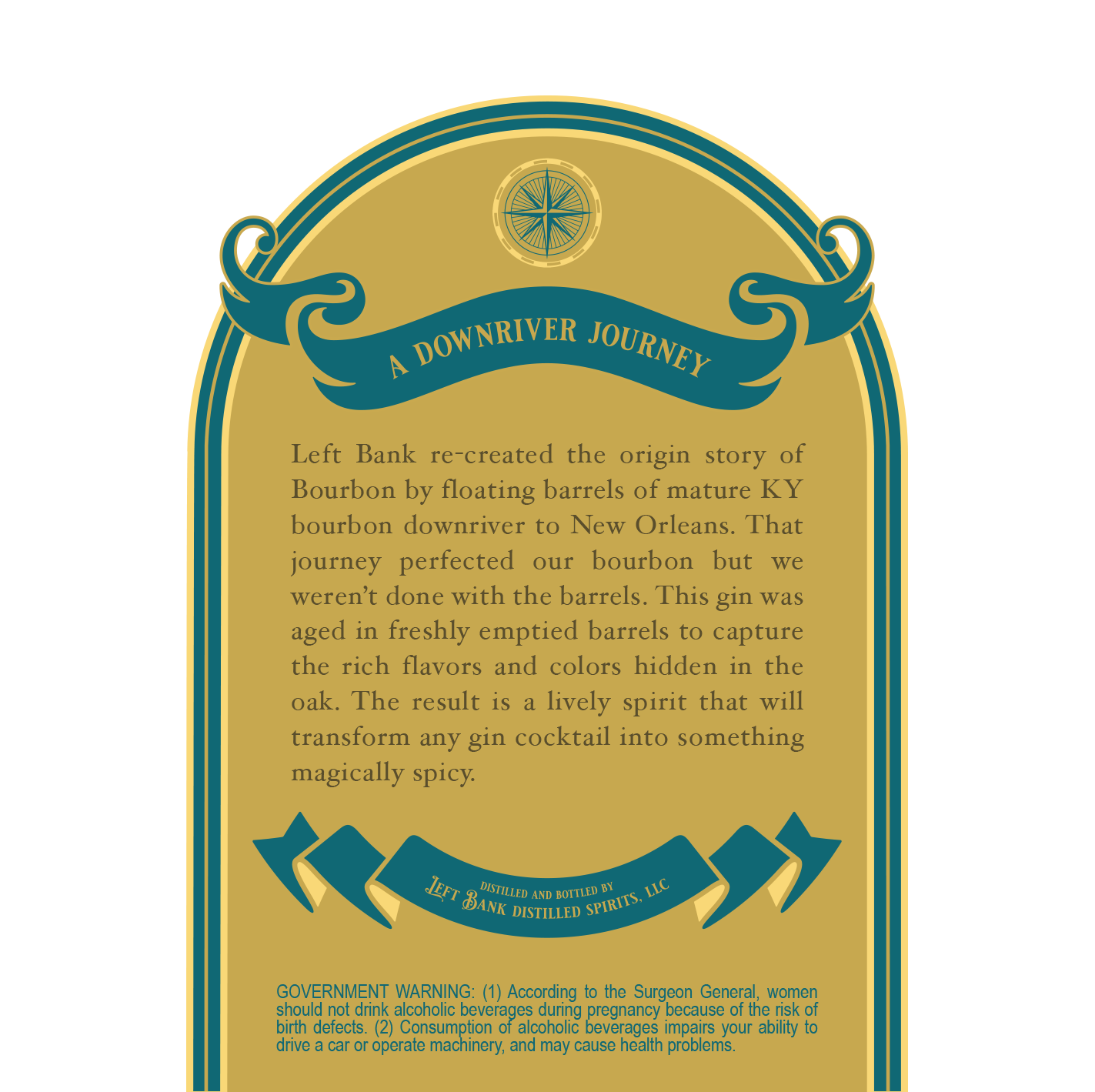
For Left Bank’s Barrel Aged Gin, the goal was to create a label that felt as rich and layered as the spirit itself. This wasn’t a traditional gin; it was aged in freshly emptied bourbon barrels, so the design needed to bridge two worlds: classic gin botanicals and the warmth and depth of bourbon heritage.
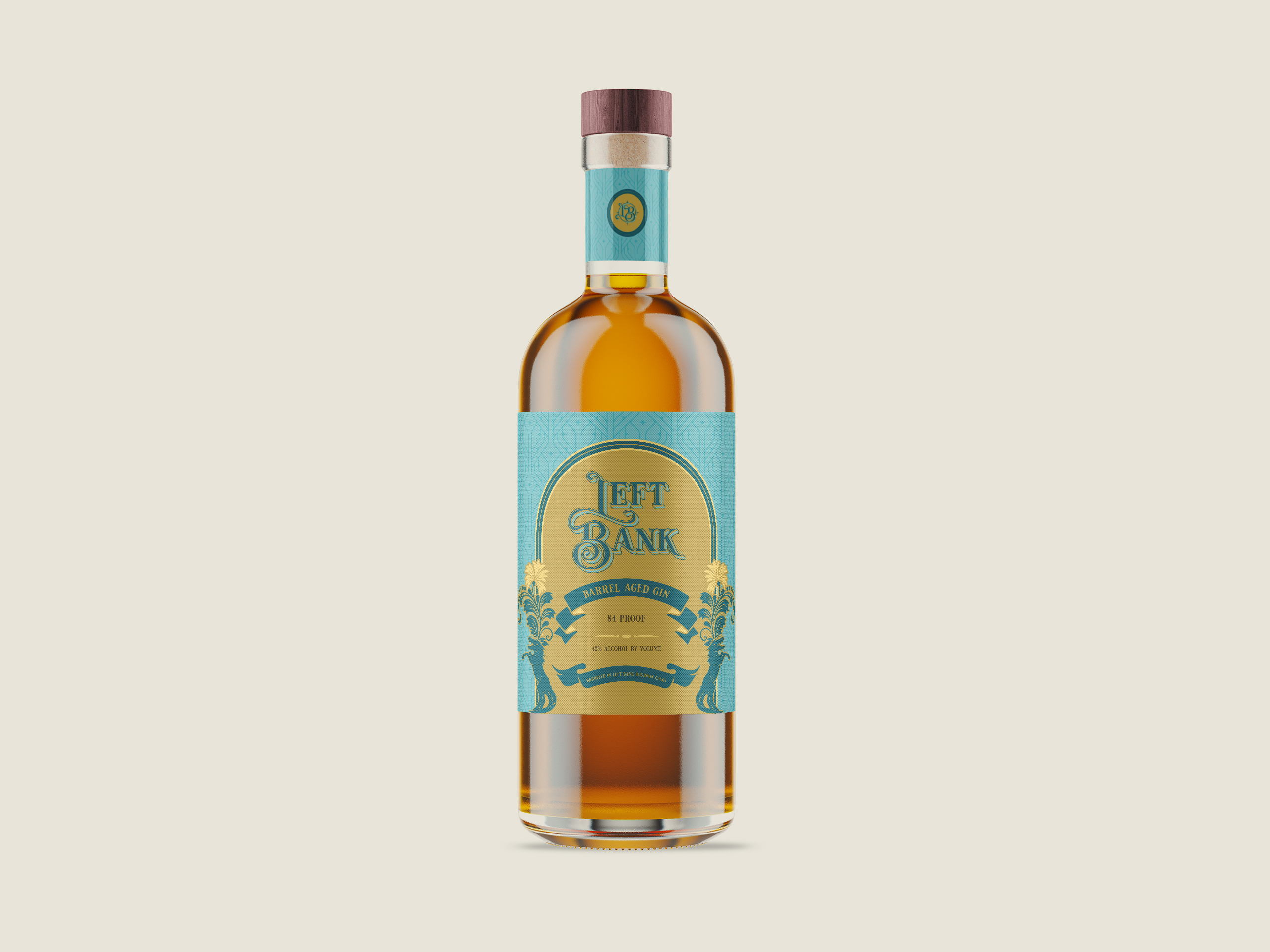
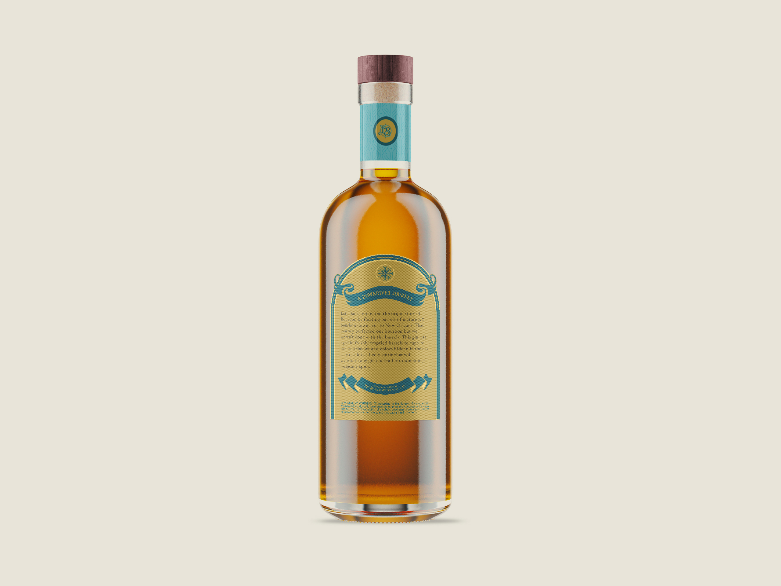
I created a visual system inspired by the vintage river trade and New Orleans culture. This design incorporates ornate typography, symmetrical flourishes, and decorative motifs that suggest movement and journey. The arch framing, ribbon elements, and detailed illustrations guide the viewer’s eye while reinforcing the brand story of barrels traveling downriver. The color palette combines deep teal with warm gold, reflecting both botanical freshness and the complexity of oak aging.